Product Design for digital freedom
Product Design
for digital freedom
Product Design
for digital freedom
Tailored homepages
for different travelers
Tailored homepages
for different travelers
Tailored homepages
for different travelers
RESPONSIBILITIES
Design Workshops
Interaction Design
Visual Design
RESPONSIBILITIES
Design Workshops
Interaction Design
Visual Design
COMPANY
GetYourGuide
GOAL
Boost conversion
TIMELINE
Jun-Sep 2023
OUTCOME
MVP personalized homes
COMPANY
GetYourGuide
GOAL
Boost conversion
TIMELINE
Jun-Sep 2023
OUTCOME
MVP personalized homes
COMPANY
GetYourGuide
GOAL
Boost conversion
TIMELINE
Jun-Sep 2023
OUTCOME
MVP personalized homes
COMPANY
GetYourGuide
GOAL
Boost conversion
TIMELINE
Jun-Sep 2023
OUTCOME
MVP personalized homes
RESPONSIBILITIES
RESPONSIBILITIES
Design Thinking Workshops
Design Thinking Workshops
Interaction Design
Interaction Design
Visual Design
Visual Design
GetYourGuide is Europe’s largest travel platform offering unforgettable experiences to modern explorers worldwide. As the company ventured into the US market, fueled by a substantial $1.1 billion funding injection, I led the design decisions to enhance conversion and engagement rates at the forefront of the user journey—the homepage. Working the Growth team, I teamed up with Product, Engineering and Content Design. We weren't just crunching data, we felt the pulse of the users, turning their insights into design solutions that tapped into big wins for the business.
GetYourGuide is Europe’s largest travel platform offering unforgettable experiences to modern explorers worldwide. As the company ventured into the US market, fueled by a substantial $1.1 billion funding injection, I led the design decisions to enhance conversion and engagement rates at the forefront of the user journey—the homepage. Working the Growth team, I teamed up with Product, Engineering and Content Design. We weren't just crunching data, we felt the pulse of the users, turning their insights into design solutions that tapped into big wins for the business.
GetYourGuide is Europe’s largest travel platform offering unforgettable experiences to modern explorers worldwide. As the company ventured into the US market, fueled by a substantial $1.1 billion funding injection, I led the design decisions to enhance conversion and engagement rates at the forefront of the user journey—the homepage. Working the Growth team, I teamed up with Product, Engineering and Content Design. We weren't just crunching data, we felt the pulse of the users, turning their insights into design solutions that tapped into big wins for the business.
Breaking free from
Breaking free from
one-size-fits-all
Breaking free from
one-size-fits-all
one-size-fits-all
The goal was clear: transform the homepage into the gateway to a personalized user experience across the product. People visit GetYourGuide with diverse intentions: from planning their next adventure to seeking inspiration for their dream vacation. Some of them are discovering their service for the first time, while others are already customers. Yet, all encountered the same generic content on the homepage. This lack of personalization led to poor content relevancy, limited brand awareness, and low engagement.
To tackle this challenge head-on, our mission was to swiftly launch new homes tailored to each customer segment. Leveraging existing components and backend logic, we aimed to craft narratives that resonated with every user. Collaboration with the Content Design was key to ensure that each home told a compelling and seamless story, catering to specific needs.
The goal was clear: transform the homepage into the gateway to a personalized user experience across the product. People visit GetYourGuide with diverse intentions: from planning their next adventure to seeking inspiration for their dream vacation. Some of them are discovering their service for the first time, while others are already customers. Yet, all encountered the same generic content on the homepage. This lack of personalization led to poor content relevancy, limited brand awareness, and low engagement.
To tackle this challenge head-on, our mission was to swiftly launch personalized homepages tailored to each customer segment. Leveraging existing components and backend logic, we aimed to craft narratives that resonated with every user. Collaboration with the Content Designer proved instrumental in ensuring that each homepage told a compelling and seamless story, catering to specific needs.
Personalization
for key users
The goal was clear: transform the homepage into the gateway to a personalized user experience across the product. People visit GetYourGuide with diverse intentions: from planning their next adventure to seeking inspiration for their dream vacation. Some of them are discovering their service for the first time, while others are already customers. Yet, all encountered the same generic content on the homepage. This lack of personalization led to poor content relevancy, limited brand awareness, and low engagement.
To tackle this challenge head-on, our mission was to swiftly launch personalized homepages tailored to each customer segment. Leveraging existing components and backend logic, we aimed to craft narratives that resonated with every user. Collaboration with the Content Designer was key to ensure that each home told a compelling and seamless story, catering to specific needs.
Personalization
Personalization
for key users
for key users
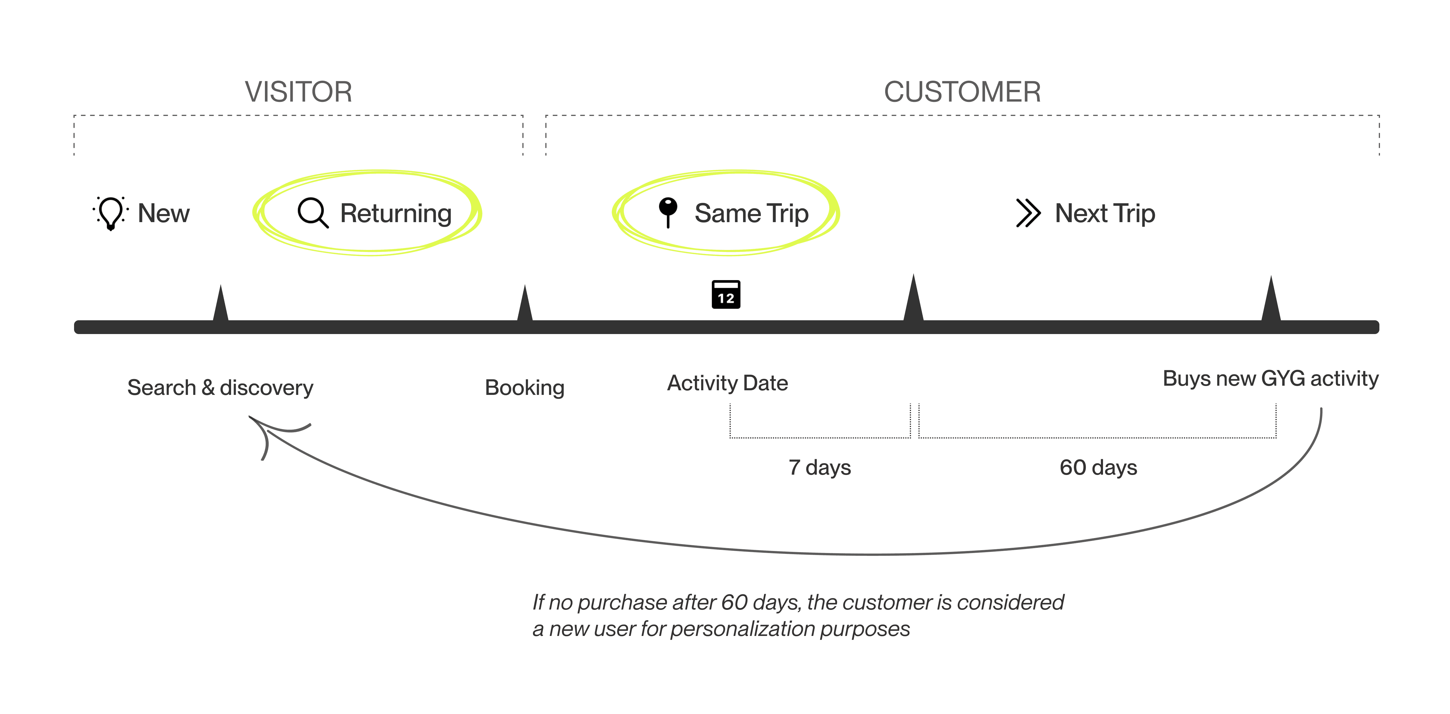
The exploration of personalized experiences led us through the distinct phases of user interaction with GetYourGuide, comprising four key stages. For this project, the primary focus was on the user segments with the greatest potential to drive business growth: returning visitors and same trip customers.
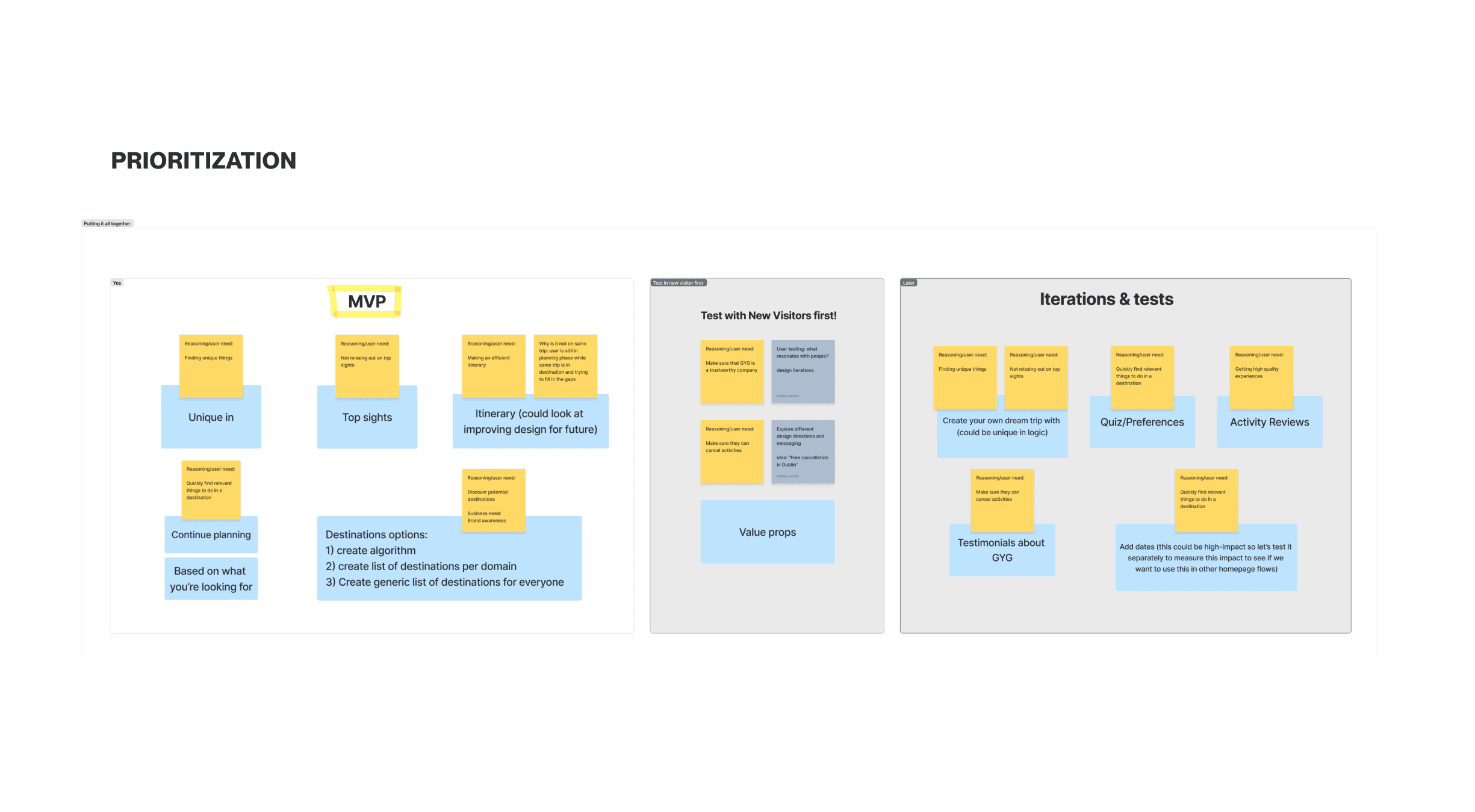
To pinpoint opportunities and guide prioritization, we leveraged a user needs framework to tailor the new homepages to their context. We effectively reengaged customers by making their experience more relevant.


Returning visitors:
Returning visitors:
Returning visitors:
boost engagement
boost engagement
boost engagement
Returning visitors are users who've created an account and showed their interest by exploring activity pages, destinations, or adding items to their wishlist within the last 60 days, yet have not made a booking. The sizing was 36% of the homepage visits. Our aim was twofold: 1) guide them towards their first booking and 2) reinforce GetYourGuide's brand as a global marketplace for travel activities, distinct from being a tour operator. This clarity ensures GYG stays top of mind for users, regardless of their destination. Highlighting GYG Originals, a collection of unique partnership experiences, was pivotal in solidifying their position as a premier curator in the travel industry.
The new design strategy prioritized a content hierarchy focused on expanding users' horizons from what they know/want to what is possible. Through a progressive disclosure approach, users were guided from familiar activities they left off to the full range of offerings and destinations.
Returning visitors are users who've created an account and showed their interest by exploring activity pages, destinations, or adding items to their wishlist within the last 60 days, yet have not made a booking. The sizing was 36% of the homepage visits. Our aim was two fold:
1) Guide them towards their first activity booking and 2) Reinforce GetYourGuide's brand as a global marketplace for travel activities, distinct from being a tour operator in a specific destination. This clarity ensures GYG stays top of mind for users, regardless of their destination. Highlighting GYG Originals, a collection of unique partnership experiences, was pivotal in solidifying GetYourGuide's position as a premier curator in the travel industry.
The new design strategy prioritized a content hierarchy focused on expanding users' horizons from what they know/want to what is possible. Through a progressive disclosure approach, users were guided from familiar activities they left off to the full range of offerings and destinations.


Current travelers:
more adventure
Internally referred to as "same trip customers," these users have at least one upcoming booking scheduled before their current trip ends. They represent 40% of homepage conversions and 25% of app visits.
The objective was to enrich their trip by facilitating additional bookings. This was a significant opportunity, considering the average customer partakes in five activities per trip, yet GetYourGuide was capturing less than two. Understanding the inventory was crucial, as data showed customers who were familiar with it tended to book multiple activities.
Current travelers:
Current travelers:
more adventure
more adventure
Internally referred to as "same trip customers," these users have at least one upcoming booking scheduled before their current trip ends. They represent 40% of homepage conversions and 25% of app visits.
The objective was to enrich their trip by facilitating additional bookings. This was a significant opportunity, considering the average customer partakes in 5 activities per trip, yet GetYourGuide was capturing less than 2. Understanding the inventory was crucial, as data showed customers who were familiar with it tended to book multiple activities.


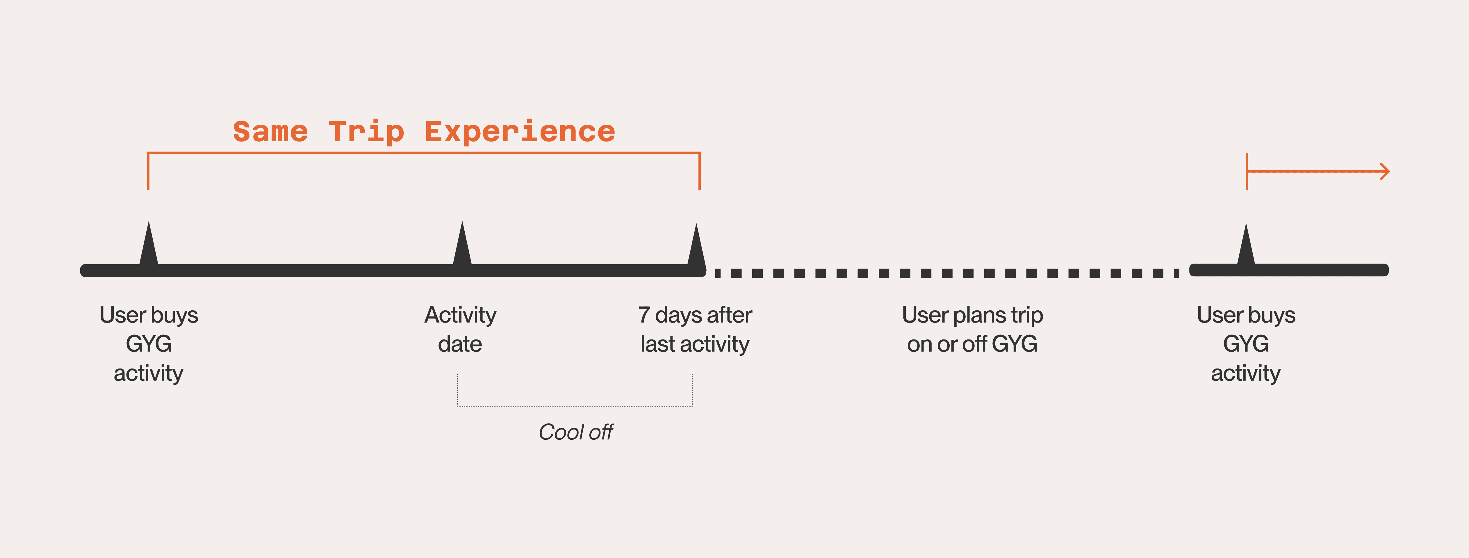
The challenge of this personalization was to identify the different trip stages, influenced by the proximity of the booked activity, and offer relevant content. Travelers with bookings scheduled for the same day or the day after are more likely to book extra activities than those with longer waiting periods. The design encouraged travelers to book activities nearby their bookings to fill gaps in their trip.
We sought to leverage the "cool down" period after an activity, capitalizing on their remaining time in the destination and their positive previous experience with GetYourGuide. The bet was offering activities taking place that same day.
Navigating these nuances prompted the exploration of various scenarios and edge cases to offer timely recommendations for effective personalization.
The challenge of this personalization was to identify the different trip stages, influenced by the proximity of the booked activity, and offer relevant content. Travelers with bookings scheduled for the same day or the day after are more likely to book extra activities than those with longer waiting periods. The design encouraged travelers to book activities nearby their bookings to fill gaps in their trip.
We sought to leverage the "cool down" period after an activity, capitalizing on their remaining time in the destination and their positive previous experience with GetYourGuide. The bet was offering activities taking place that same day.
Navigating these nuances prompted the exploration of various scenarios and edge cases to offer timely recommendations and achieve effective personalization.


Experiments
Experiments
Experiments
for quick evolution
for quick evolution
for quick evolution
We embraced the ethos of quick experimentation as a guiding principle to learn fast. The objective was to unveil new iterations of the homepage, treating each deployment as a unique opportunity for fine-tuning our approach.
The numbers speak for themselves for the first version of the personalized homepages. Within just one month of launching the conversion rate increased 4.44% for returning visitors and 3.5% for same trip customers.
This success story underscores not only the efficacy of the strategies employed but also the boundless potential of agile experimentation in driving continuous improvement and sustainable growth.


